
Exploring Tarot and Lenormand through the hues of art theory and the color wheel.
When I was first playing around with the idea of hexagonal tiles, for some reason the color wheel came to mind. Allowing the honeycomb shape of the hexagons blend with the primary and secondary colors started to reveal a possible new spread.
Colors have a way of making us feel. Sure there are the learned reactions, like red universally being a sign to Stop and take a look, yellow may be to proceed with caution and green is Go!!!
However, if we were to take it a step deeper, we may see what those colors individually mean to us. For example does red really mean stop for you or is it more situational? What do you feel when you see it, what emotions and memories come up? All of these can be blended into a reading.

What would happen if you were to take the primary colors of Red, Yellow, Blue and make a keyword list from your own personal associations? These may be the focal points of an unfolding story, the things that are the most important.
Alternately or rather continuing with the theory, we can add the secondary colors of Orange, Green and Violet. Adding keywords to those to help expand on the dialog.
This is the inspiration for the Color Wheel Casting board.

Again inspired by the layout of the traditional color wheel in art. However, only utilizing the primary and secondary colors for the main image. We have the 6 color honeycomb. The center hexagon being the focus of the story. The colorwheel casting board uses hexagon spaces to be paired with any hex shaped deck or tiles. Please know that you can use any cards in the same layout to see what messages come up. I do not want to limit by saying you need our boards to do this layout, Use what you have, my goal is to inspire always and forever.
To begin, I will strongly suggest you journal out what the colors mean for you. This is important as it will help to make it more personal for you and your practice.
If you want to get a quick start there’s always a quick internet search on what colors “mean”, as well as entire studies done on the psychology of color. Just keep in mind that these are still other people’s words and findings or relationships with color. It’s a good jump off point to help build you list, but please go deeper and see what these colors mean for you.
If you wish to get creative in your tarot journal, you can do as I have done, draw a color wheel and in the spaces provided jot down your keywords.
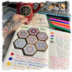
I dubbed it the “6 Sided Story” however it’s really become more than that.
The center space is the focus of the reading. Everything else radiates out from that while spiraling back to “talk” about it, describe or even build upon.
Building the positions:
Red, Yellow & Blue become the primary influences
- Red: Bold, demands immediate attention. Could also be an inciting incident.
- Yellow: A point of caution or even the bright side. What is in focus or seen.
- Blue: Investigation helps to cool down the situation. Research to understand this.
Orange, Green & Violet become the secondary influences
- Orange: Get creative, use this to stand out and be seen, do more of this.
- Green: This aids in a positive leaning development. Can also show where envious tendencies may reside (depends on the reading)
- Violet: Universal plan. This is a reveal of what may be under the surface or what is coming to fruition.
*At this point I should mention that I developed the positions based off of some of my personal keywords for the colors. Red being bold giving a sense of urgency, what causes excitement… This helps to describe the position. Feel free to come up with your own placements based on your relationship with the colors.
When exploring the reading, you should absolutely journal your findings, or my favorite is to speak them aloud while recording the reading (I have an overhead phone holder clamped to a shelf). This allows for a connection to the stream of consciousness and you may be a bit surprised as to what is said in the playback.
Continuing the conversation:
Since this spread is based off of the color wheel, as I mentioned… it would be a disservice to not see how the colors interact based off the principles of color theory. These positions are also amazing ways to get deeper information or clarifying on what has already been said.

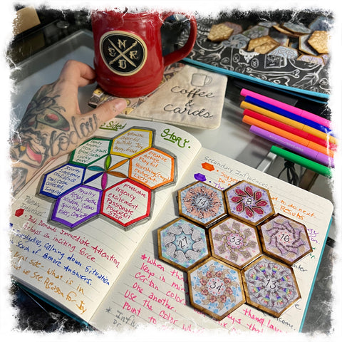
Complementary pairings:
Complementary colors are opposite each other on the color wheel, they really work well together. With this set we can see how the positions pair the cards. They will help to enhance the situation or story. Using the same method from our keywords we can build an over all feel for the positions. My example is:
- Red/Green: Bold, authentic advice or organic provocation
- Blue/Orange: Blissful action to take or use caution while investigating
- Yellow/Violet: A gut feeling from the universe becasue of this.
If you’d like to know what’s happening on the periphery lets look at other types of pairings.

Tertiary color pairings:
These are next to each other and become a mixture of a primary and a secondary. Using the keywords, you can build a prompt for these as well:
- Red-Orange: Bold and Bright
- Yellow-Orange: Bright and Creative
- Yellow-Green: Happy and Pure
- Blue-Green: Calm and Plentiful
- Blue-Violet: Spiritual Bliss
- Red-Violet: Powerful Wisdom
So taking the 2 card positions that land in these spaces and reading them together with the colors as the theme. Look at how they might pair to offer advice about the prompts, or perhaps they will help you maneuver being “bright and creative” by implementing what you know about the meanings of the cards.
If you haven’t figured out by now, I LOVE layering, it has become the best way for me to get outside of the learned boxes that I like to shove myself in. Pairing methodologies give me the permission to integrate play into my divination.
One last layer:

Color linkages:
I’m sure you’ve heard the term “Warm tones” or “Cool tones” when referring to color. In this last section we can explore those linkages as a 3 card reading with that theme in mind. Think about what those tones mean to you? Are you a summer and autumn kind of person or perhaps Winter and Spring is more your thing. Seasons are interlaced in color theory.
Warm color connections:
Red/Orange/Yellow —These 3 heat up the reading, they are an active gut feeling that needs urgent attention.
Cool color connections:
Violet/Blue/Green — These 3 calm the reading down, a fresh vast spiritual message. These may literally have your back.

Before I leave you with your markers, sketchbooks and cards— assuming you’re inspired to creatively play with this method. I want to emphasize again to take some time to site with each color to see what they mean to you. Which are your least favorite colors or combinations and why? Alternately, which are your favorite colors or combinations and why? This is all very important as it will help you to navigate the color wheel from your own perspective.
Just like art, there may be the “elements, rules and theories” behind it, but in the end it is extremely subjective.
What I have proposed here for you, is simply a map and a system… how you interpret it will be entirely up to you!
Happy Creating!
♥️- J
PS: I have created a whole color series of casting stickers as well as the larger color wheel casting board. They are all found here in my shop!
Comments